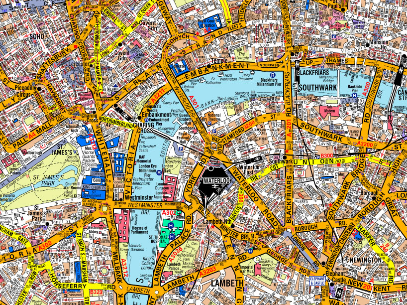
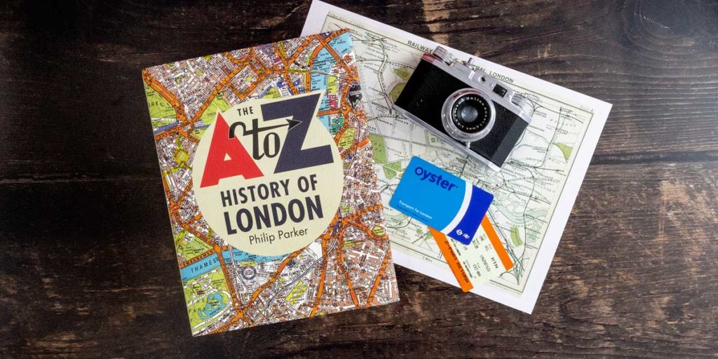
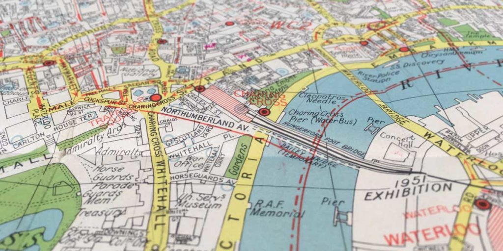
Open a map page in your A-Z street map or other quality street atlas. You will immediately notice the main roads and landscape features like rivers and parks, showing you the lay of the land. Focus in on a neighbourhood and you’ll see the network of side streets, their names, and how they connect to each other. You’ll start to spot other local features like schools and postcode information. The map shows all this richness of detail, but not in a way that stopped you seeing the bigger picture at a glance. This is just one part of good map design.
Last month we looked at how we keep our maps as accurate and up-to-date as possible. Now let’s look at another part of the map-makers art – a few of the things we do to make the maps as clear as possible.
Map design
Why is it a challenge to make a clear map? The answer comes from two basic limitations: the limited space on the page or screen, and the limited space in our brains! Faced with an immensely complex world, the map maker has to create a simplified picture. They have to show the essential features of an area, but not overwhelm the viewer with too much detail. The big decisions are selecting what to show and how to show it.
When deciding what to show, we need to consider the likely uses of the map. For example, our visitor’s maps emphasize visitor attractions and leisure facilities; on standard street maps, some of these will be left off or be less prominent. We’ll look at the map content in more detail in a future blog post.
Maps are basically made of simple shapes – areas, lines and dots – and text (“labels”). Again the map maker has myriad choices on how to show things: colours, sizes, fonts, and whether to show the real extent of something or just a simple symbol.
Cartographic generalisation
A-Z’s stylised cartography is used to make clear maps that are easy to read. Roads are shown with a greater width than they actually have on the ground. This lets them stand out, and gives space for large, clear road names. Their shapes might be smoothed and simplified, but the essential layout is kept for accurate navigation.
Another example is railway stations. Stations will often be shown with a standard symbol that is simple to spot and understand. We could try to show the exact shape of buildings and platforms, but this is rarely essential information, and the overall map would become harder to use.
A sign of good cartography is how bigger, more important places stand out from lesser ones. This is often an issue in online maps like Google Maps. When zooming in, the map will often show smaller town and village names with much bigger place names no longer visible. A paper map does not suffer from this loss of context, helping people to better understand locations and get their bearings.
Getting the details right
A-Z maps go through a carefully quality control process to make sure features are shown clearly and effectively. Just one part of this is tidying around page edges. When a road crosses a page edge, we don’t want the name to be cut off. We try to fit the name label on both pages, so the map reader doesn’t have to turn the page.
Cartography is a specialist profession, and we’ve barely scratched the surface here. It is easy to learn more about maps though: just look at a few for an area you know. Compare the features they show and how they show them, and you’ll start to see the choices that the cartographer has to make.


